User Experience
This section describes the motivations, assumptions, and directions behind
Chromium and Chromium OS's user interface design.
Its goal is to explain the current design in a way that further work can be
developed in-style, or so that our assumptions can be challenged, changed, and
improved.

Chrome Features
Window
Window Frame | Tabs | Throbber | Toolbar | Omnibox
Browsing
Bookmarks | History | New Tab Page
Additional UI
Downloads | Status Bubble | Find in Page | Options | Incognito
Notifications | Infobars | Multiple Chrome Users
Appearance
Visual Design | Resolution Independence | Themes
Accessibility
Keyboard Access | Touch Access | Low-Vision Support | Screen reader support
UI text
Write strings | Write message descriptions
UX themes
Content not chrome
- In the long term, we think of Chromium as a tabbed window manager or shell for the web rather than a browser application. We avoid putting things into our UI in the same way you would hope that Apple and Microsoft would avoid putting things into the standard window frames of applications on their operating systems.
- The tab is our equivalent of a desktop application's title bar; the frame containing the tabs is a convenient mechanism for managing groups of those applications. In future, there may be other tab types that do not host the normal browser toolbar.
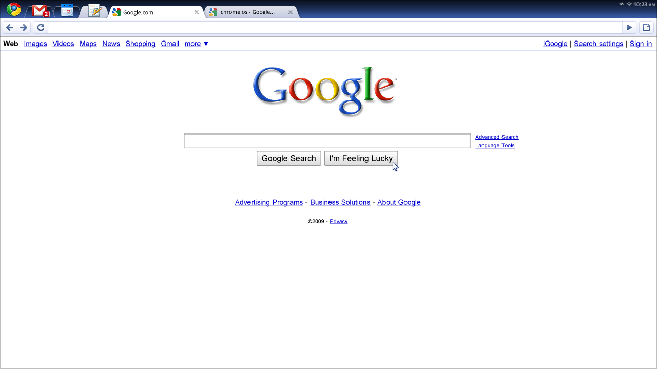
- Chrome OS: A system UI that uses as little screen space as possible by combining apps and standard web pages into a minimal tab strip: While existing operating systems have web tabs and native applications in two separate strips, Chromium OS combines these, giving you access to everything from one strip. The tab is the equivalent of a desktop application's title bar; the frame containing the tabs is a simple mechanism for managing sets of those applications and pages. We are exploring three main variants for the window UI. All of them reflect this unified strip.
- Chrome OS: Reduced window management: No pixel-level window
positioning, instead operating in a full-screen mode and exploring
new ways to handle secondary tasks:
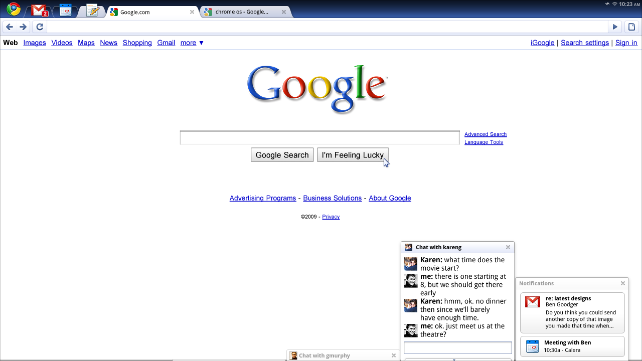
- Panels, floating windows that can dock to the bottom of the screen as a means of handling tasks like chat, music players, or other accessories.
- Split screen, for viewing two pieces of content side-by-side.
Light, fast, responsive, tactile
- Chromium should feel lightweight (cognitively and physically) and fast.
Web applications with the functionality of desktop applications
- Enhanced functionality through HTML 5: offline modes, background processing, notifications, and more.
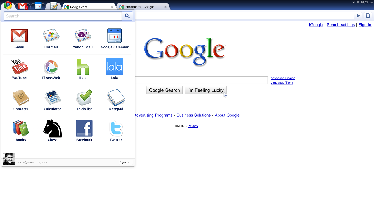
- Better access points and discovery: On Chromium-based browsers, we've addressed the access point issue by allowing applications to install shortcuts on your desktop. Similarly, we are using pinned tabs and search as a way to quickly access apps in Chromium OS.
- While the tab bar is sufficient to access existing tabs, we are creating a new primary access point that provides a list of frequently used applications and tools.
Search as a primary form of navigation
- Chromium's address bar and the Quick Search Box have simplified the way you access personal content and the web. In Chromium OS, we are unifying the behavior of the two, and exploring how each can be used to make navigation faster and more intuitive.

Chrome OS Features
Note: UI under development. Designs are subject to change.
Primary UI
Window UI Variations | Window Management | Pinned Tabs | Apps Menu | Panels
UI Elements | Gestures | System Status
Core Applications
Settings | Content Browser | Open/Save Dialogs | Shelf
Devices
Form Factors | Resolution Independence
Video and Screenshots
The implementation, the concept video, and the screenshots are presenting different UI explorations. Expect to see some variation.


